
Aplikato
Applying user research to redesign a mobile first recruiting website
Role: UX/UI Design
Tools: Figma

Context
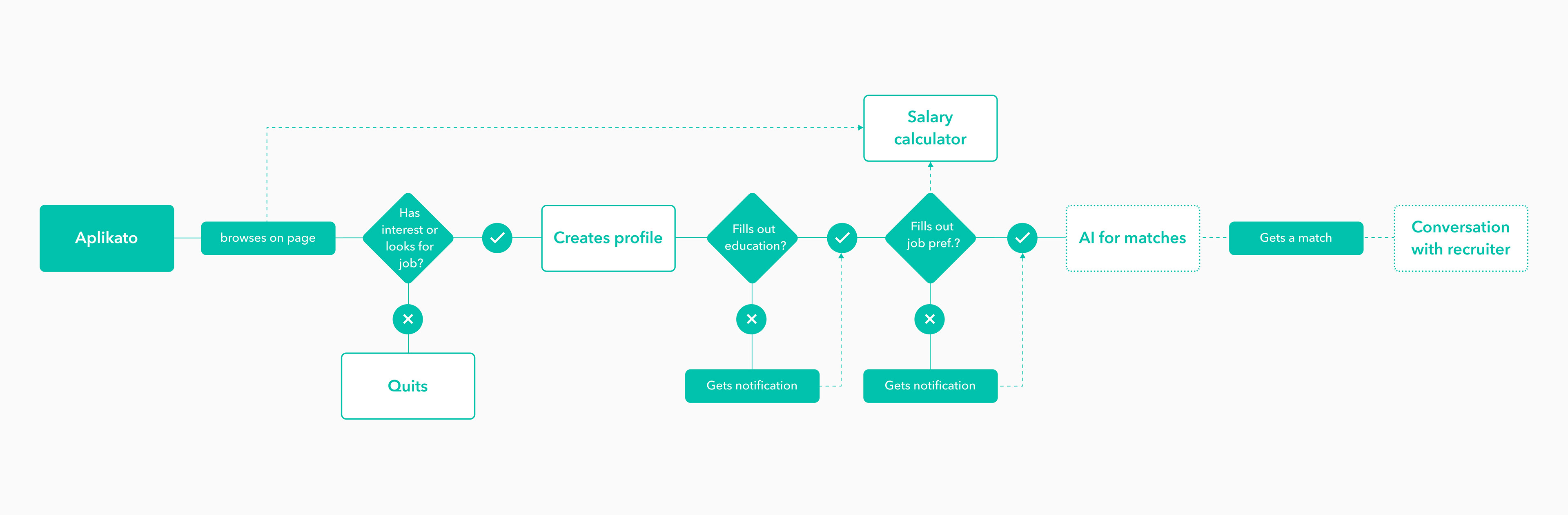
Aplikato is a German recruiting start-up that matches freshly graduated job seekers and companies. The candidates can register on Aplikato's website and create a profile, the start-up searches then open positions that correspond to the seeker's job preferences.
Challenge
Before doing the redesign Aplikato only had 24 registrations and 1 applicant signed a job contract with a company. Several potential causes had been pointed out by the client and some users, such as the length of the registration process. But this and other assumptions about the user’s behaviors and context had to be validated. The goal of the project is to get more registrations and a bigger candidate database.
Process
I started the project with research to understand better the platform and the user needs. Therefore I did user testing with 6 students and a survey about job search that got responded by 98 people.

Problem
After the research, I pointed out two main problems:
· Long process in filling out information to the profile and salary calculator
· Several users didn’t have a professional impression of the existing platform
· Long process in filling out information to the profile and salary calculator
· Several users didn’t have a professional impression of the existing platform
With that in mind, I built my user personas:

Strategy
After pointing out the problems I had two main focuses for the website:
· Make the fill-in process faster and add login with social media platforms
· Give a young but professional look
· Make the fill-in process faster and add login with social media platforms
· Give a young but professional look
Final result
Mobile-first. As nearly all the visits on the website are done from a mobile device, the new design should be mobile-first.
Social media login. The survey showed that Facebook was with 89% the most used platform where participating persons have an account. Professional social media platforms like LinkedIn (31%) and Xing (29%) are less used. With this information, I decided to use Facebook and LinkedIn as social media platforms to make the registration and login process faster.
Profile overview. In comparison to the old profile, the new one has a match section where the user can see his matches and upcoming interviews. Input fields differently grouped to prevent that a user has to fill in the same information several times.
Don’t miss to try out the prototype!

Status
The new design is not developed yet. Once done, several KPI’s will be evaluated, especially the number of new registrations.
Illustrations: Indian Doodle Illustration Pack